
Fitvation 🏋
In this case study, I’ll walk through the research process and design decisions behind creating an app that’s both intuitive and user-centered.
The idea behind Fitvation was to democratise fitness — making personal training more accessible and tailored to everyone’s needs. During user interviews, I discovered that people seek personal trainers for different reasons: while some active users want to refine their gym techniques, others simply need motivation — someone to run with, do light exercises, or take the first step toward a healthier lifestyle.
To meet these diverse needs, I identified an opportunity to connect users with trainers of varying experience levels. For example, newly qualified personal trainers looking to build their client base could perfectly support beginners seeking simple, approachable activities. In essence, Fitvation bridges this gap — matching user needs with the right fitness support through thoughtful design and user insight.
Problem
Statement

Many users express a desire to exercise using gym equipment or outdoors, but they often lack the motivation to take the first step on their own. The crowded and intimidating atmosphere of a busy gym can exacerbate this reluctance.
Despite the benefits of having a personal trainer, many users find it too expensive or challenging to find one, as most personal trainers work at a gym. This can create a significant barrier to achieving fitness goals.
Furthermore, the inconvenience of traveling to a distant gym can be a significant source of demotivation for users.
A more convenient and accessible solution is needed to help users overcome these obstacles and stay on track with their fitness journey.
Furthermore, the inconvenience of traveling to a distant gym can be a significant source of demotivation for users.
A more convenient and accessible solution is needed to help users overcome these obstacles and stay on track with their fitness journey.
Competitive Analysis
To gain a deeper understanding of the fitness apps in the market, assessing their offerings and identifying their strengths and weaknesses, I initiated a comprehensive competitive analysis. Specifically, I selected two apps, Kanthaka and PTfinder, to evaluate.
This analysis provided valuable insights into the pros and cons of each app, offering a broad starting point for further exploration and strategic considerations that were used to develop Fitvation.
Here, are a few of the insights:
PRO: The initial price for a session is prominently displayed on the home page, making it easy for users to understand the cost of the service.

CON: The personal trainer filtering features within these apps could be better explored. Ex: adding options such as preferences related to LGBTQ-friendly trainers or languages spoken.
CON: The company's social media presence weak. By increasing their social media activity, they could engage with customers more effectively, build brand awareness, and attract new customers to their service.
CON: The customer care team had a delay in responding to my inquiry sent via email, taking several days to provide a response. I also reached out to them through their social media channels but did not receive any replies.

User Research
After evaluating the strengths and weaknesses of two apps, several questions arose in my mind. To address these inquiries comprehensively, I chose to conduct user research.
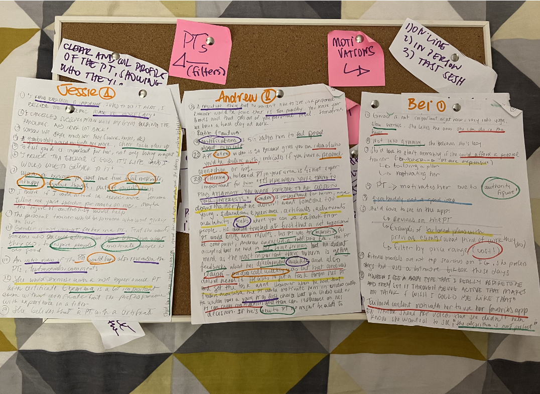
This involved in-depth user interviews with three participants via Zoom, each lasting approximately 30-40 minutes.
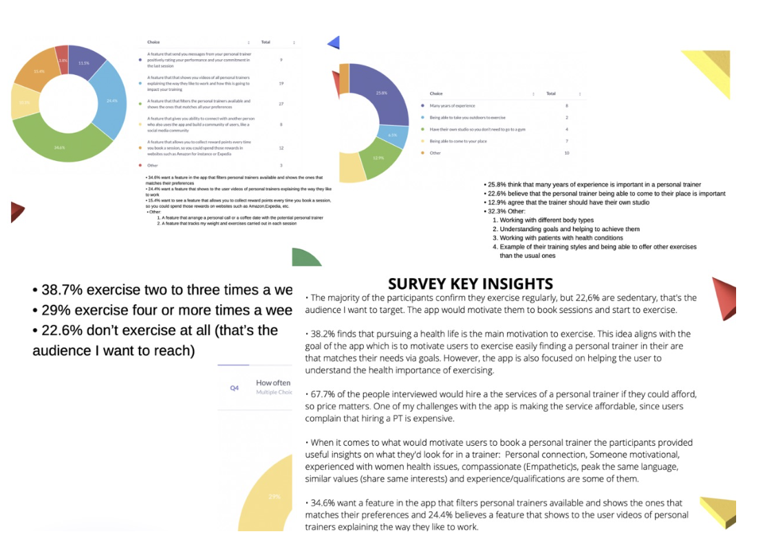
Additionally, I distributed a survey to ensure a robust collection of both quantitative data.
“What would make you more likely to book a personal training session through an app?”
“What might stop you from booking a personal trainer through a fitness app?”
“When you think of the perfect personal trainer, what matters most to you?
What qualities make a personal trainer great, in your opinion?
What do you value most in a personal trainer?”
“What makes it hard for you to exercise at the gym or outdoors?”
“What usually gets in the way of your workouts?”
“What’s the biggest barrier keeping you from working out regularly?”
“What would make you feel motivated to start exercising?”
What could inspire you to get moving more often?”
”If you wanted to start working out, what would help you get started?”
Participants

BEI
• In a relationship
• 26 years old
•Female
• Partnership Manager
• Lives in London
• British Chinese

JESSIE
• Single
• 35 years old
•Female
• Personal Assistant
• Lives in London
• Afro Portuguese

ANDRYI
• Single
• 39 years old
•Male
• Retail Manager
• Lives in London
• Ukranian

Key findings
👉The cost of a personal trainer is still an issue.
👉 Unexperienced personal trainers would be hired, if they cost less than experienced ones.
👉 Notifications and positive messages would motivate users to book sessions.
👉 Videos of trainers is a feature that users approve and believe this would help them to show personal trainers personality.
👉 Users like the idea of using filters to match the perfect trainer to them.
User Stories
“As a user, I want to be able to find personal trainers around my area, so that I can book a session.”
“As an ex-gym goer, I want to be able to find personal trainers searching via postcode, so that I can find a personal trainer near me.”
“As a business man who works in different parts of the city, I want to be able to find personal trainers online working around my area even if their profile is based in a different area, so that I can book someone instantly.”
“As a user, I want to be able to see personalized filters on the app, so that I can book a trainer based on my needs and goals.”
Personas
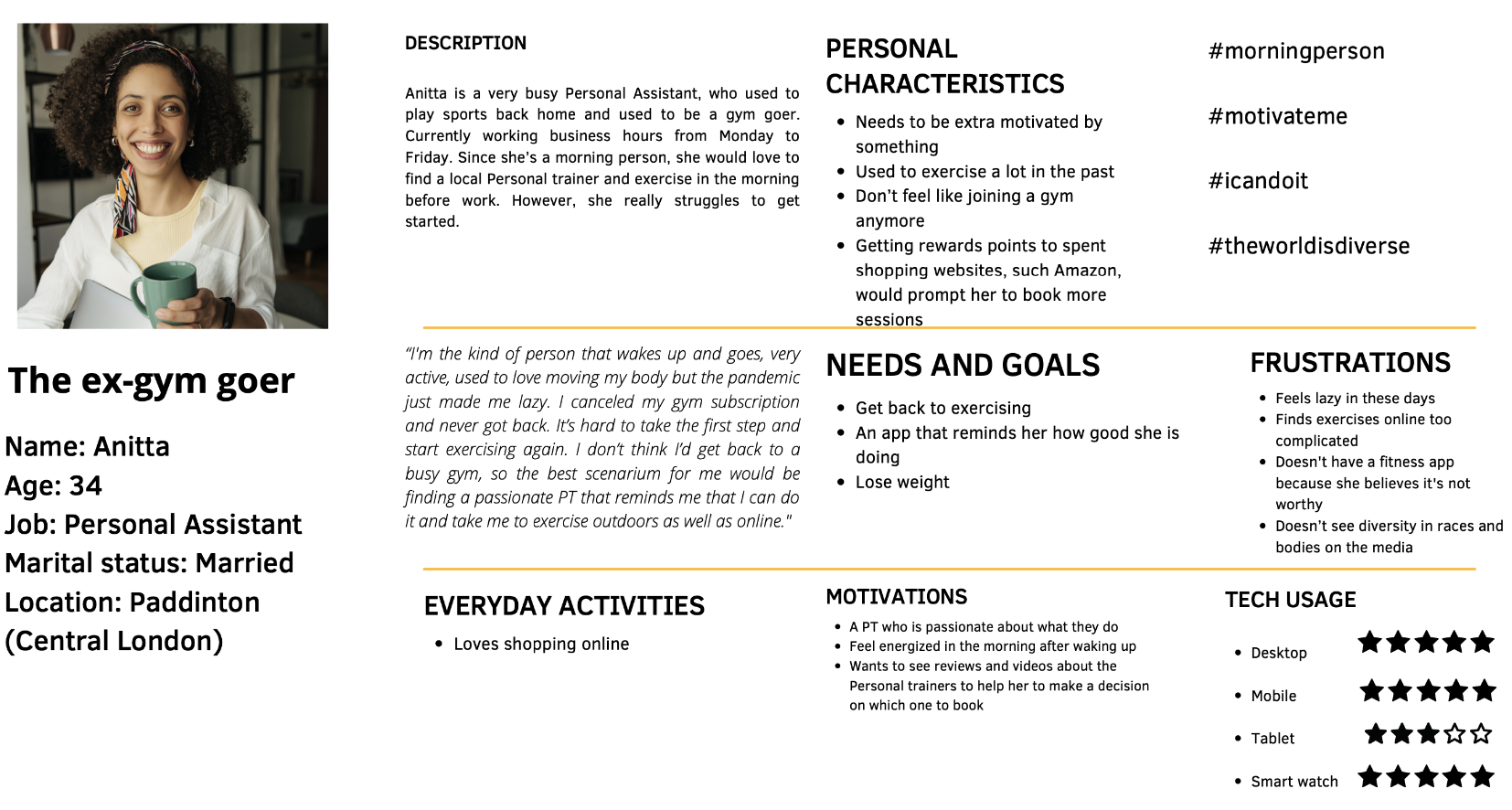
To create a better understanding of who I was designing for, I made 3 personas for each user group based on interviews and surveys.
These personas helped me understand what the users wanted, needed, and how they behaved.
Here is one of them, Anita
User journey maps
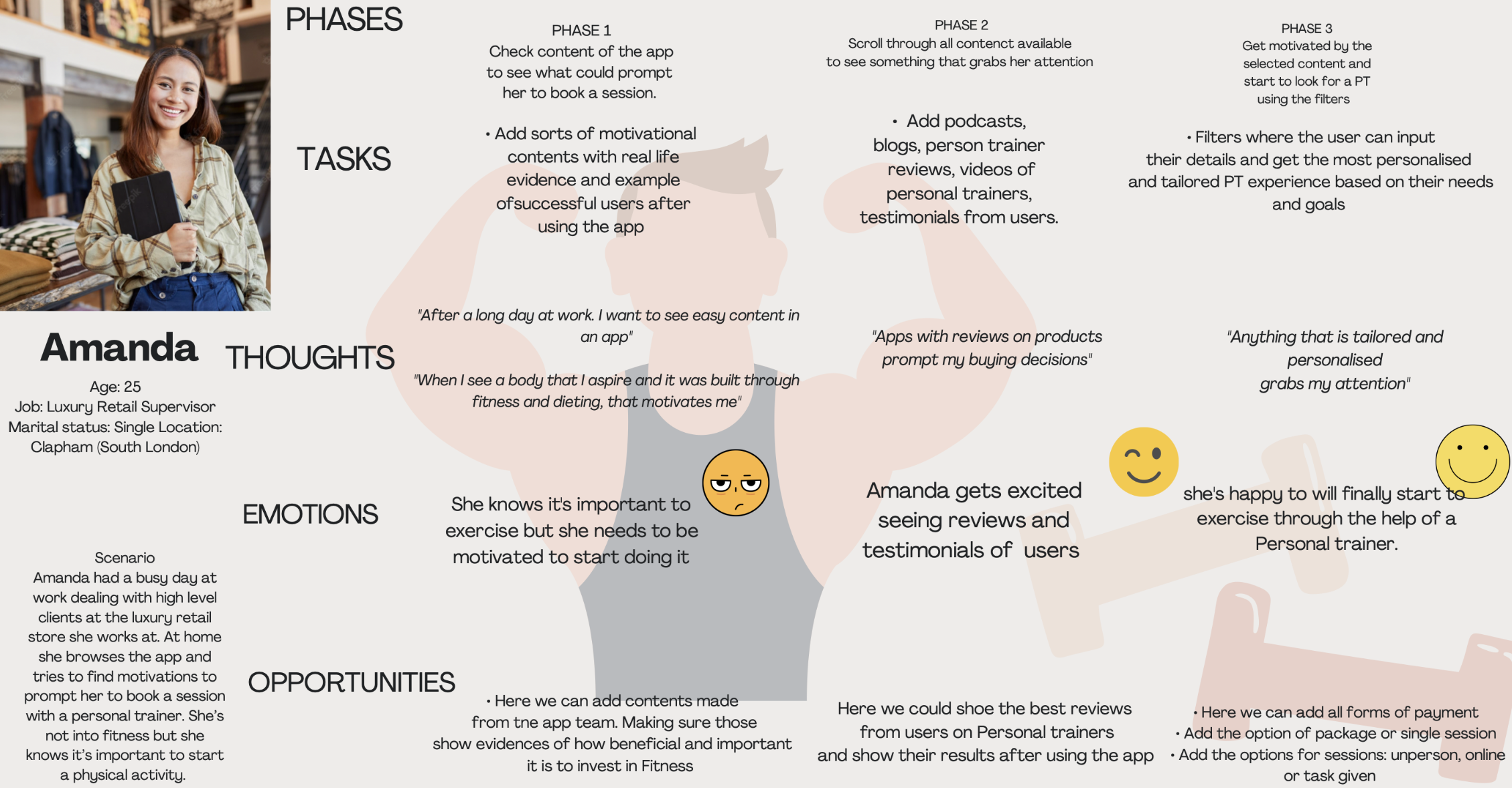
Creating user journey map for my personas gave me the opportunity to focus on not only who my personas represent, but which goals, habits and behaviours they exhibit in reference to my project.
Here is one of them, Amanda
User flows
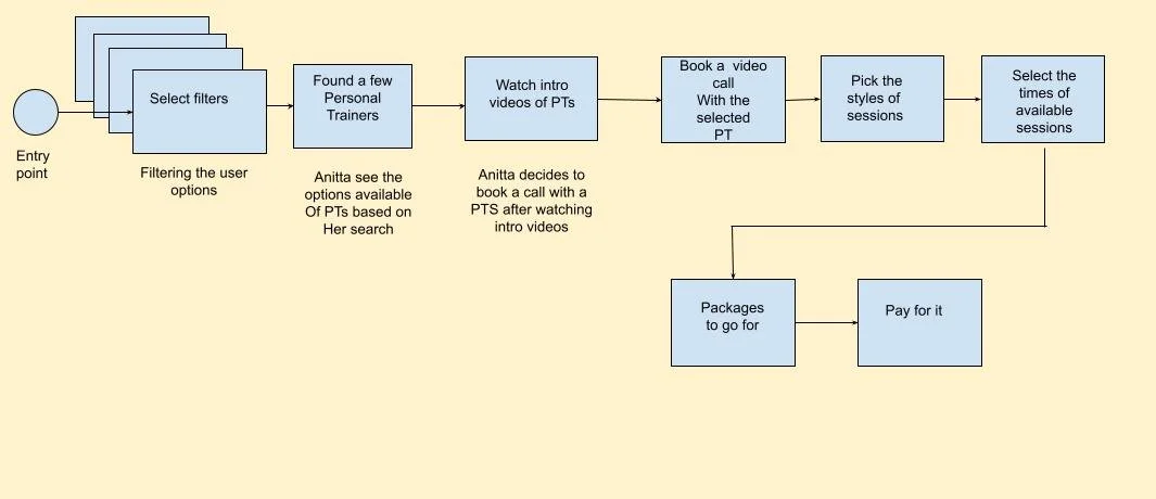
User flows helped map out the “flow” of a specific action that Amanda, Scott or Anita might take while attempting to accomplish a goal.
They’re valuable for identifying every point of interaction within Fitvation. I've also used them as the first building blocks of information architecture.
Low fidelity wireframes
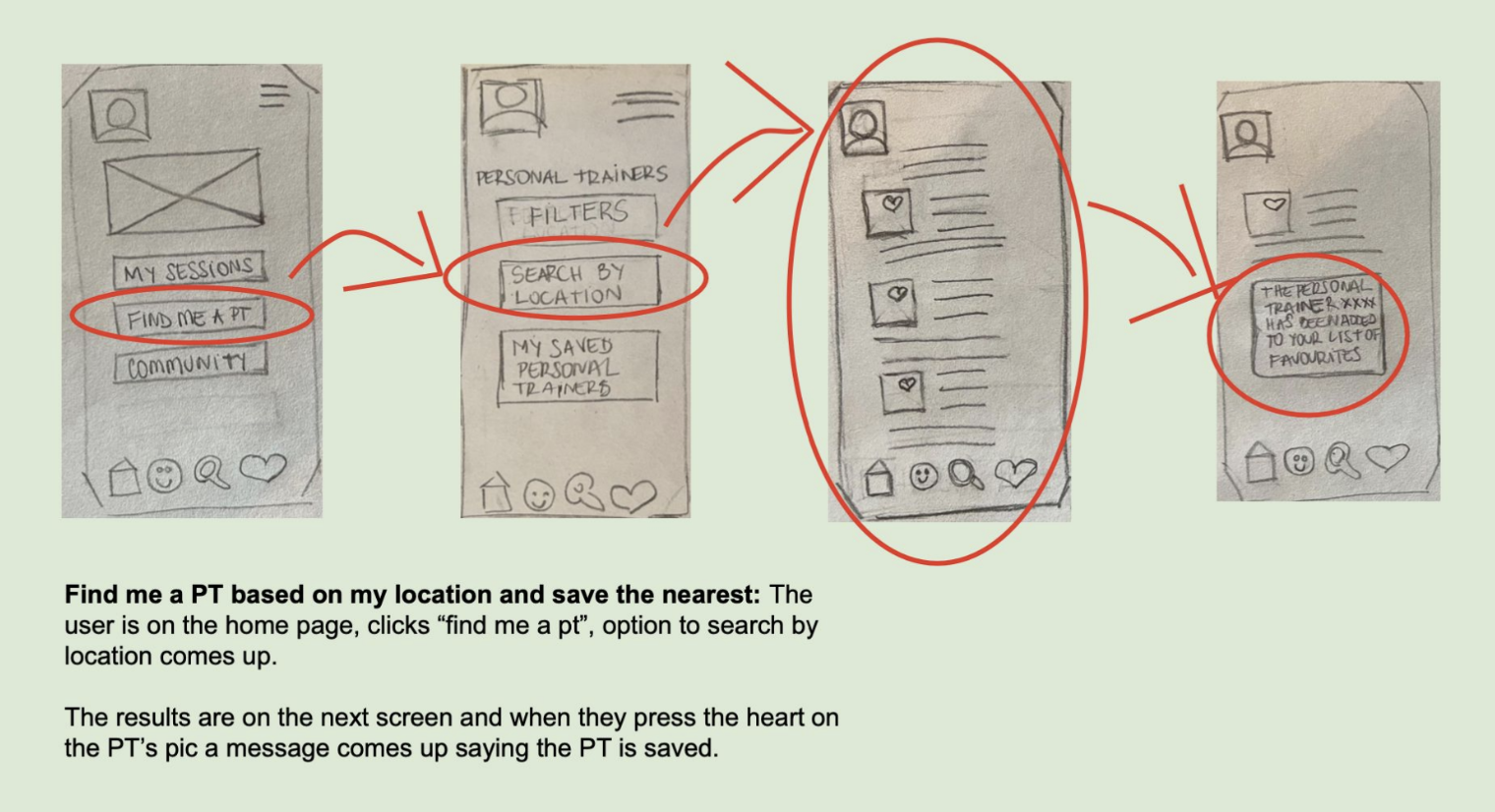
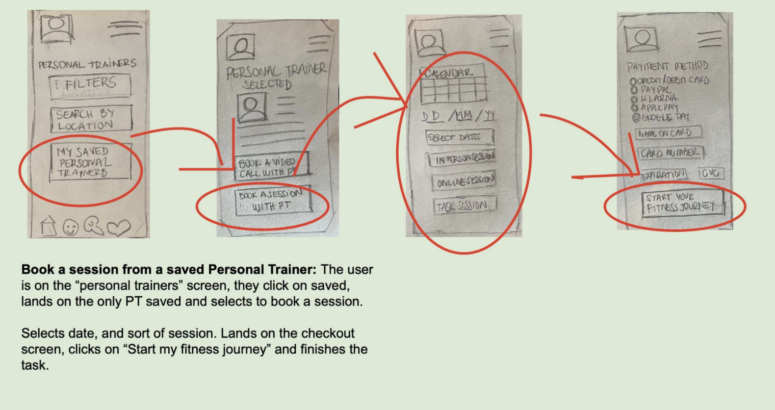
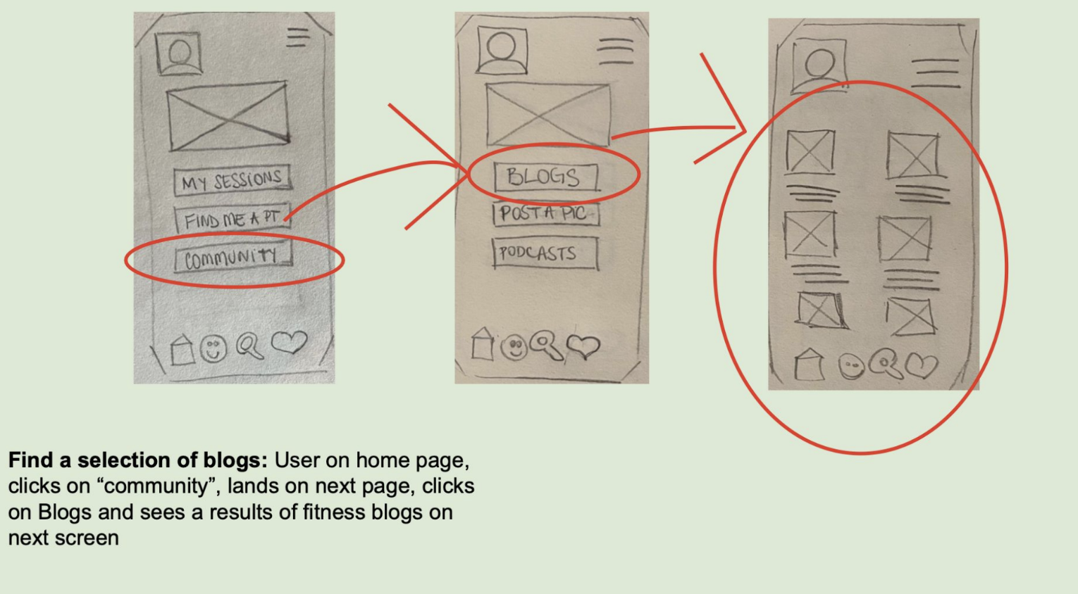
To prioritise the core structure and navigation of my app over complex functions, I chose to create a low-fidelity prototype initially.
These wireframes serve as a simplified representation of my product's user interface, emphasising on layout, structure, and content.
By excluding design elements, they convey the fundamental layout and functionality of my product.
Low fidelity Prototype
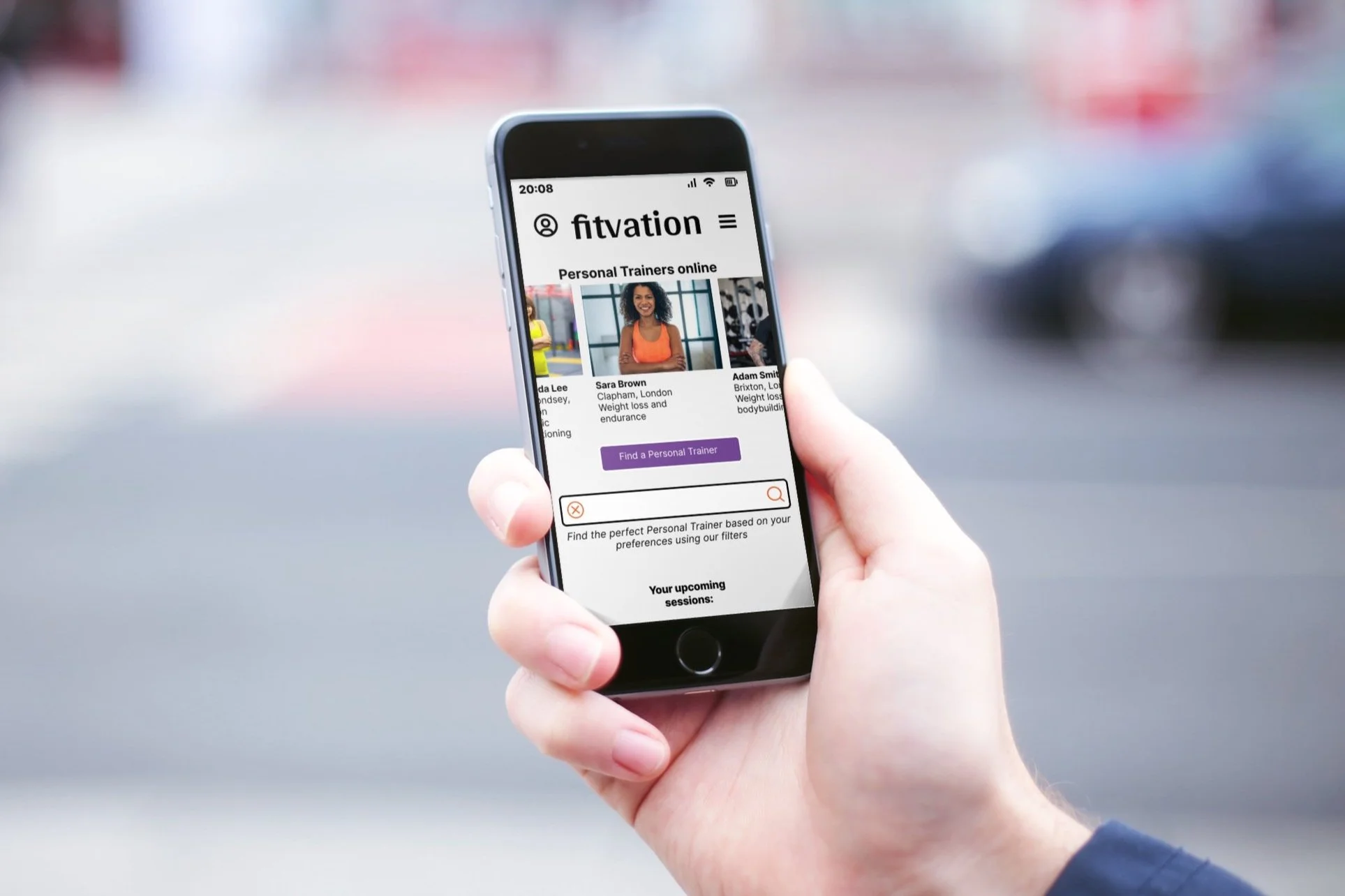
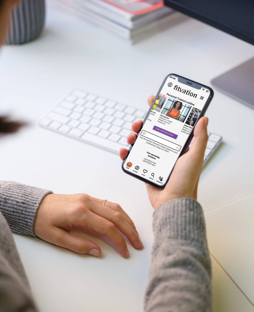
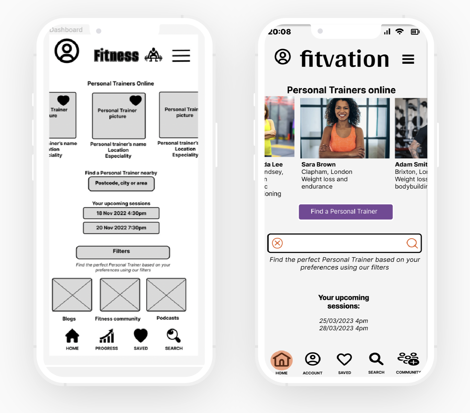
Here, we can see two screens, one from a low-fidelity prototype and the other from a high-fidelity prototype.
Usability Testing
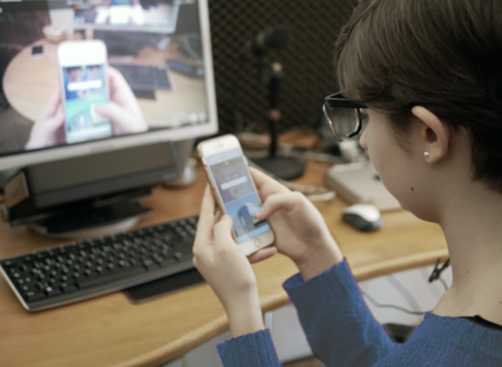
My goal was to leverage the valuable feedback obtained from the usability tests.
To achieve this, I utilised the powerful Affinity mapping technique to systematically isolate and extract pertinent information from the videos of the tests.
I then grouped the data based on common themes and transferred them onto a dynamic Rainbow spreadsheet for further analysis.

Test Report
Click on this LINK to access the Fitvation Rainbow Spreadsheet with data from the participants of the Usability Test and the Test Results.
Testing the low-fidelity prototype with the participants was crucial to identify the factors causing friction in the app.
After analysing the insights of the Test Results I made a few necessary changes for the final high-fidelity version. See a couple of examples below:
At this stage, I carried out usability testing sessions with six participants.
The process included collaborating with test users, observing their interactions, analysing outcomes, applying design refinements, and outlining strategies for future rounds of testing.
The primary aim was to ensure the product delivers a seamless, user-centered experience aligned with real user needs.
Issues encountered after Usability Tests & adjustments made
ISSUE: Users clicked on his studio to book an “in person session with a PT at their own studio” instead of first clicking on “in person” first. Instead of click on "In Person" first.
NUMBER OF ERRORS: 4 participants
TYPE OF ERROR BASED O JAKOB NIELSE’S SCALE: Usability catastrophe.
ACTION TAKEN: Added colors to differentiate the button as a primary button.
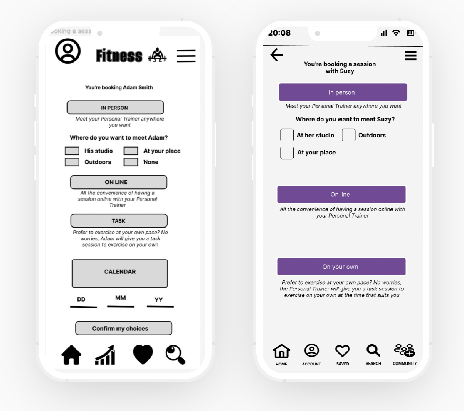
ISSUE: Don't understand what the “task” button is about at first but understand what it is after reading the text.
NUMBER OF ERRORS: 6 participants
TYPE OF ERROR BASED O JAKOB NIELSE’S SCALE: Major usability problem.
ACTION TAKEN: Added colours to differentiate the button as a primary button and rename the button to "On your own", as suggested by users.
High-fidelity prototype
Flow 1- The user downloaded the up, creates an account with email and password, they want to find a Personal Trainer that fits their budget and has their own studio. After find the professional they want to save the first Personal trainer that came up in the search results and come back to the Home Screen.
Flow 2 - The user has to find a list of saved PTs, book an in person session session with the PT saved, meeting them at their studio at any date, pay with credit card and get back to the home screen.
Flow 3 - The user has to find the feed where users/members of the app are posting pictures of their workout, post a picture of themselves from their phone gallery, and get back to the home page.
Below there's the prototype designed in Figma.
Design
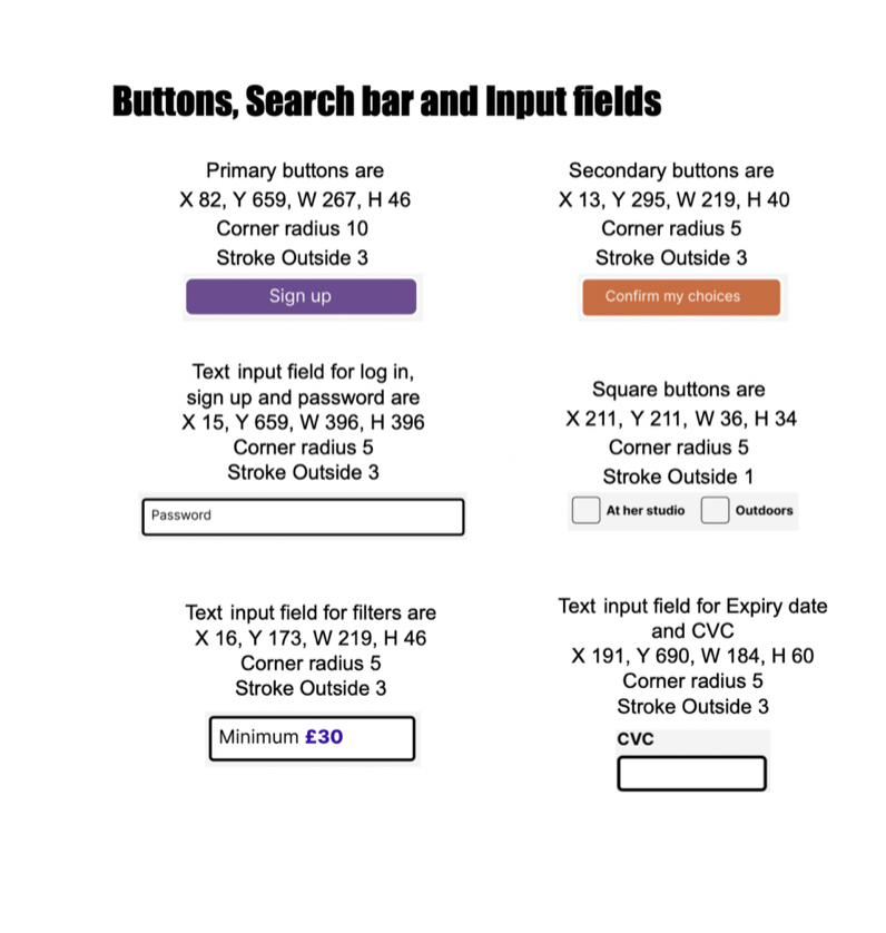
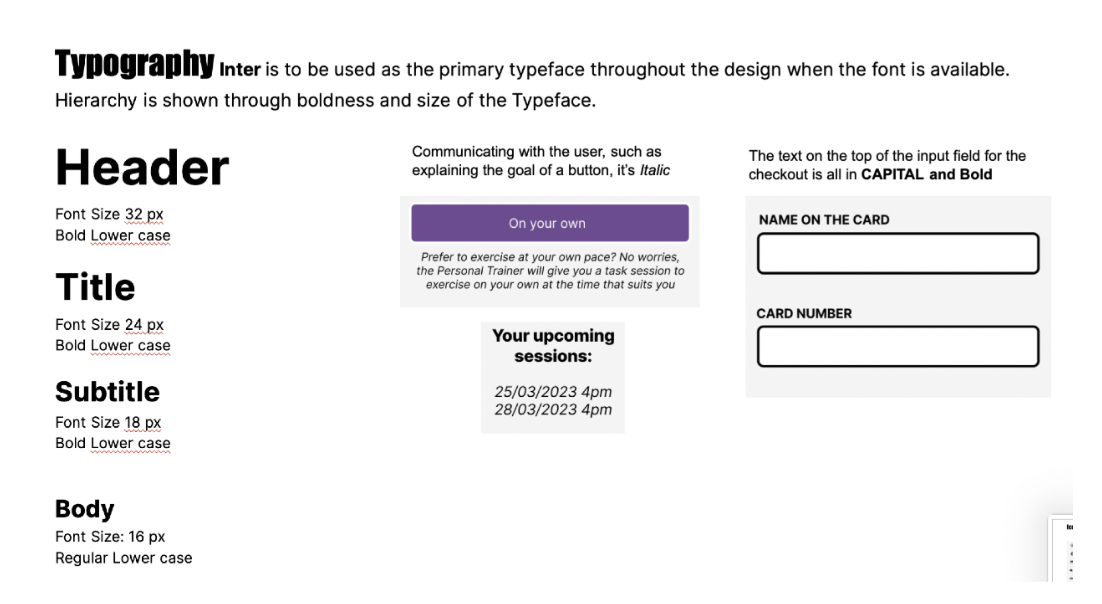
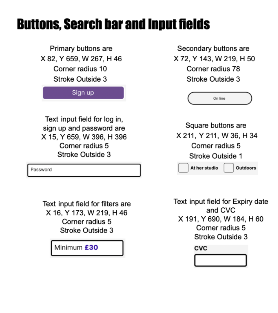
Documentation

Last considerations 💭🤔
Throughout this project, I learned how crucial it is to develop a deep understanding of users and their needs. Design is an iterative process, and user testing plays a key role in uncovering and addressing potential issues early on.
Moving forward, I would also incorporate usability testing at multiple stages of the design process, staying open to feedback, iterating on designs, and continuously refining the experience. Embracing this iterative approach can lead to a more polished, intuitive, and user-friendly version of FITVATION.